The Hospital Homepage Is Back, But with a Different Job.
AI search may be changing how patients arrive on hospital websites. The homepage needs to route intent, not collect every internal priority.
Watch on YouTube | Listen on Spotify
Healthcare marketers have historically focused their work on service line, condition, physician, location, and campaign pages.
That investment made sense. Organic search rewarded specificity. Patients were entering hospital websites through the side door, closer to the information they were already looking for. The homepage still mattered, but it was no longer the default starting point for every journey.
AI search is complicating that pattern.
Patients are now asking health questions off-site. They're comparing symptoms, treatments, providers, and more before they ever reach a hospital website. By the time they search for your hospital by name, they are further along: confirming a choice, looking for the next step, or trying to get something done.
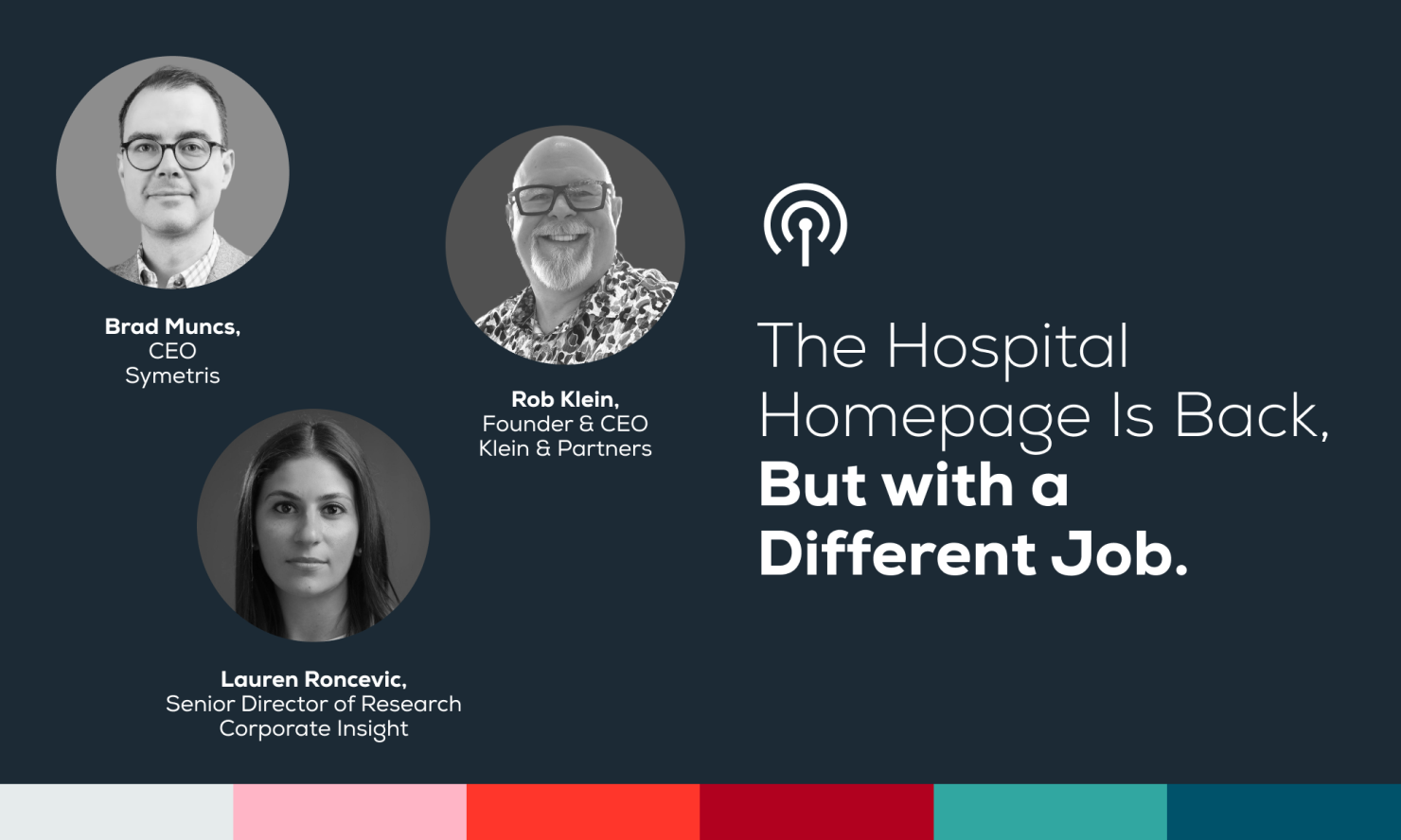
That tension shaped a recent webinar I joined with Rob Klein of Klein & Partners and Lauren Roncevic of Corporate Insight. We concluded that the homepage is regaining relevance, but its role is changing.
[Link to full webinar recording]
The homepage is relevant again
The search environment is behaving differently than it used to.
Because AI Overviews and LLMs mention hospitals and systems by name without links, patients then type the name of institutions directly in the Google search bar. This has increased homepage traffic by 10.7%. AI may be reducing some top-of-funnel clicks while sending more users to brand-level entry points later in the decision process. Rob also pointed to a healthcare search pattern worth watching: branded organic traffic, such as searches for a hospital system by name, is gaining ground relative to treatment queries like “knee replacement” or “bariatric surgery”.
This lines up with what many healthcare marketers are already seeing: fewer casual discovery visits, more branded searches, and more visitors who arrive with a task in mind.
Service line pages and physician profiles still matter enormously. The shift is that the homepage is now carrying higher-intent traffic than many teams expected a few years ago.
That changes how you should approach the homepage. Instead of asking "How do we make the homepage impressive?", figure out how you help the patient take the next right step.
The site visitor is arriving more informed
74% of hospital visitors are current patients with a specific task. Many are trying to log in, find the portal, schedule, pay a bill, find a provider, confirm a location, or get to the right part of the site.
Yet many homepages still behave as if the visitor is asking, “Who are you?” A higher-intent visitor is usually closer to a practical question: “Where do I go next?”
Rob put it plainly in the discussion: users are not always there to keep being sold. In many cases, they have already made some kind of decision. Now they want to get down to business.
Trust still matters. Healthcare is not a retail checkout flow. A patient choosing a hospital, physician, or service line is looking for more than the next available slot. They need confidence. They need signals that this is the right system, the right specialty, the right physician, or the right location.
But the balance is changing. The homepage has to support trust without making the patient walk through a brand narrative before they can act.
Lauren made a similar point from the benchmarking side: health systems are moving toward more transactional, search-optimized, self-service homepage experiences. These are homepages for “patients who arrive ready to act, not to browse.”
The homepage has less room for ambiguity.
The homepage should route intent, not collect priorities
A homepage with more intent does not need more stuff, and this is where teams can get into trouble.
A lot of health systems hear "make the homepage more actionable" and they start adding things. Search modules, quick links, scheduling widgets, awards, videos, chatbots… the list goes on. The page becomes more functional, but not necessarily clearer.
The homepage should work more like an intent router. New and prospective patients need clear paths to services, doctors, locations, and care options. Returning patients need access to MyChart, portal tools, bill pay, medical records, scheduling, and practical support. Professionals, job candidates, researchers, donors, and referring physicians also have real journeys. And these audiences should not all receive the same weight at the top of the page.
Homepage governance gets difficult here. Every internal audience can make a reasonable argument for visibility. The service line wants promotion. HR wants careers. Philanthropy wants donations. Communications wants news. Leadership wants awards. Clinical stakeholders want their programs featured.
Rob’s research surfaced navigation and menu structure as a major friction point. One user quote captured the problem well: “Too many choices. Too many ambiguous headings. Too many rabbit holes.”
A better model gives each audience a lane. Main navigation should largely support patient acquisition and care discovery. Secondary navigation should support returning patients and professional audiences. Search should be visible, but it should not be treated like magic if the search experience cannot understand patient language. Brand and trust content should support decision-making. Organizational content should have a place further down the page.
That is an operational decision as much as a design decision. The homepage becomes far more useful when the organization agrees on what it is for.
Mobile exposes the real priorities
Mobile is a useful prioritization test because it reveals what the organization actually believes matters. If an element cannot justify its place on the first mobile screen, it may not deserve prime homepage real estate. Most homepage debates would get clearer if teams solved the mobile version first.
On desktop, teams can keep adding rows, cards, banners, menus, modules, campaign blocks, and secondary messages. The page may be crowded, but there is still space to absorb the compromise. Not on mobile.
A phone screen forces the question healthcare teams try to avoid on desktop: what deserves to appear first?
For a hospital homepage, the first mobile screen should do a few things well. It should make navigation or search easy to access, then give the visitor a small number of high-value actions such as finding a doctor, finding a location, getting care, paying a bill, or logging in.
A giant hero image cannot do that job. Neither can a campaign message that pushes the task down the screen, or a complex widget that looked fine in a desktop mockup but becomes clumsy on a phone.
A homepage click is only a promise
The homepage starts the path. It does not convert by itself.
This is why many homepage improvement efforts stop too early. Teams clean up the homepage, simplify the navigation, improve the CTAs, and move important links higher on the page. All useful work. Then the visitor clicks, and the next page fails to keep that promise.
Examples of broken homepage promises:
- "Book an appointment" leads to a generic directory.
- "Find care" leads to a broad service index.
- A service line page reads like a brochure instead of helping someone choose.
- A location page does not make hours, services, phone numbers, insurance, or next steps clear enough.
- A portal link is visible, but the login experience still assumes the patient remembers how to use a system they may only visit a few times a year.
A CTA is a promise. The next click has to keep it.
This is especially important for service line pages. A patient who clicks into heart care, orthopedics, maternity, cancer care, or primary care probably does not need a generic explanation of what that department does. At least not first.
They need decision support. They need to know whether this is the right place for them, where care is available, which doctors they can see, whether insurance is accepted, what other patients say, what makes the team different, and what they should do next.
Provider profiles, patient testimonials, and specialty spotlights are not just decorative. When someone is choosing between systems, physicians, or locations, those elements can influence the decision.
And placement matters. Trust signals are useful when they show up where the patient is making a choice.
Homepage optimization is journey design. The homepage routes intent. The next page has to help the visitor decide and act.
The homepage gets a second look
The homepage is back in the conversation, which gives healthcare teams another chance to decide what it is actually for.
The old job was to introduce the organization. The new job is to help the visitor get to their next step.
That is harder than adding another module. It requires saying no, moving content lower, separating audiences, and admitting that not every internal priority deserves prime real estate.
If patient behavior is bringing more intent back to the homepage, the worst response is to rebuild the same clutter with newer tools and call it progress.