From Information Pages to Decision Pages: How Healthcare Websites Need to Change
Too many healthcare pages still explain rather than help people decide. Here’s how to improve high-intent pages without turning it into a full redesign.
Too many healthcare pages are still built to explain rather than to help people decide. The job of high-intent pages is no longer to walk someone through broad context first. It is to help them quickly understand fit, credibility, and next steps.
I talked about this in a recent webinar titled From Browsing to Transacting with Adrienne Woods of Hackensack Meridian Health and Chris Pace of SearchStax. We were coming at it from different angles, but landing on the same basic problem: the pages that matter most are still organized like information pages when they need to function more like decision pages.
Patients are not browsing. They are deciding.
“Patients aren’t there to enjoy content. They’re there to take an action.”
- Adrienne Woods, VP Digital Engagement at Hackensack Meridian Health
That should be an uncomfortable statement for a lot of healthcare websites, because many of them are still structured as if their main job is to keep people reading. They lead with explanation, background, and institutional framing, then ask the user to work harder than they should to figure out what to do next. That model made more sense when the website played a larger educational role earlier in the patient journey. It makes less sense now on pages where intent is already high.
We are now in a “low-click era”: fewer visits, faster decisions, higher expectations, and confirmation rather than education. By the time many patients reach the website, they have already searched elsewhere, asked an AI tool, read reviews, and narrowed their options. They are not starting from zero. They are arriving with more context and less patience.
Hospital websites are operating under higher stakes, and that changes the job of the page. If someone lands on a provider, service-line, or location page, they are not looking for a mini brochure. They are trying to answer a tighter set of questions. Am I in the right place? Can this team help with what I need? Where do I go next? The more directly a page helps answer those questions, the more useful it becomes. The more it delays those answers, the more likely it is to lose the moment.
What healthcare information pages still get wrong
Many healthcare pages still follow an old pattern. They explain the service, describe the condition, add some general reassurance, and only later get to the part a patient actually care about most. Who can help me? Where do I go? Do you take my insurance? How do I book? That structure is not accidental. It comes from a time when the website was expected to do more of the educational heavy lifting.
The problem is that this structure asks too much of the user. It assumes they are willing to read first and decide later. On high-intent pages, that is often backwards. Users are not looking for detailed information and trying to reduce uncertainty and move forward. That is why these pages often feel busy but not useful. They contain a lot of content, but not enough of the right content in the right order.
This is also where your information-page-versus-decision-page visual earns its keep. An information page tends to lead with explanation. A decision page leads with the signals that help someone judge fit and take the next step. That difference is not just aesthetic. It changes whether the page helps or delays.
What decision pages do differently
“The things you need to know very quickly are right up front.” - Adrienne Woods
A decision page does not eliminate information. It brings the relevant, actionable information to the forefront. Its job is to help someone answer a tighter set of questions, quickly.
- Am I in the right place?
- Does this team handle what I need?
- Who can I see?
- Where can I go?
- What makes this option credible?
- What should I do next?
A good decision page brings those answers forward instead of making the visitor dig for them.
That usually means moving different elements higher than healthcare teams are used to. Not because every page needs to look like a retail landing page, but because high-intent users need decision support more than they need a wall of exposition. Adrienne made that tangible in our webinar when she talked about people wanting to see ratings, insurance, physicians, and access cues immediately rather than hunting for them across the page.
This shift also means being more specific about why your organization is the right choice. Not generic claims about excellence. Not broad language about compassionate care. Useful specifics. What is different here? What makes this easier, faster, or more credible for the patient trying to choose?
A simple test helps. If a patient lands on this page ready to act, can they get what they need to decide without slowing down or starting over? If the answer is no, the page is still doing too much explaining and not enough helping.
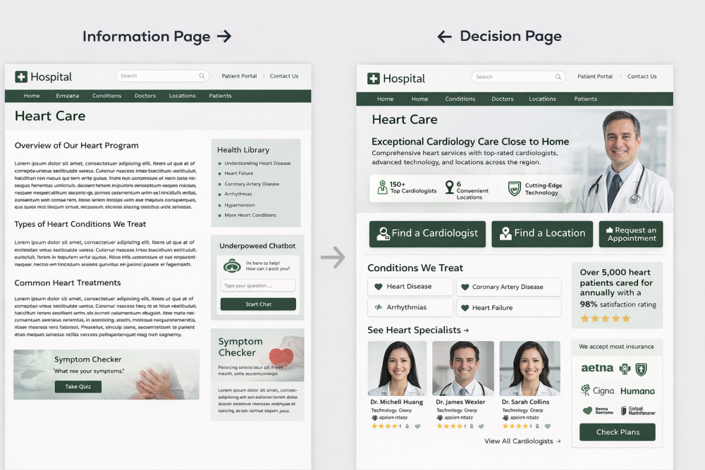
AI-generated example of the difference between an Information Page vs a Decision Page
Where search raises the stakes
“The search is not just a backup.” - Brad Muncs
Search is not the whole story here, but it makes the problem harder to ignore.
People are arriving on pages with more specific intent than they used to. Sometimes that intent comes from Google and AI summaries. Sometimes from internal site search or chatbots. However they got there, the page they land on now has less room for confusion.
Search and chatbot behavior exposes what people are really trying to do. It can show what they expected to find, what language they used, and where your the website is still making them work too hard. Use this data to influence upcoming content and page design.
This is one reason decision pages matter more now. Search shortens the path between intent and arrival. If the page still behaves like a generic information hub, the mismatch becomes obvious faster.
Where to start without redesigning everything
You don’t need to turn these insights into another giant redesign initiative.
Most healthcare teams need to pick a few page types that carry high intent and rethink what those pages are being asked to do. Service line pages, provider pages and location pages are a great place to start because the stakes are highest and the user intent is clearest.
That usually means:
- Changing visual hierarchy before changing everything else.
- Moving decision-support elements higher.
- Reducing calls to action that distract from the main task.
- Connecting the page more clearly to doctors, locations, and availability.
- Tightening the content around what helps someone choose.
- Keeping the broader explanatory content lower on the page or on supporting pages where it still adds value.
You can improve the pages patients already rely on without waiting for a full rebuild that may take a year to approve and another year to launch.
The bigger issue is not that healthcare websites have too much content. It is that too many important pages are still organized around what organizations want to say instead of what the patient needs to decide.